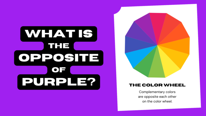
If you are interested in color theory, you might have wondered what is the opposite of purple. Purple is a secondary color, meaning that it is made by mixing two primary colors: red and blue. But what color can you mix with purple to create a neutral gray? Or what color can you use to contrast with purple and make it stand out? In this blog post, we will answer these questions and more, by exploring the concept of opposite colors, also known as complementary colors.
What are Complementary Colors?
Complementary colors are pairs of colors that are located opposite each other on the color wheel. The color wheel is a circular diagram that shows the relationships between different hues. There are different types of color wheels, but the most common one is based on the three primary colors: red, yellow, and blue. By mixing these colors in different proportions, you can create secondary colors (green, orange, and purple) and tertiary colors (colors that are a mix of a primary and a secondary color, such as yellow-green or red-orange).
Complementary colors have a high contrast, meaning that they create a strong visual impact when placed next to each other. They also cancel each other out when mixed, resulting in a neutral gray. For example, if you mix red and green, you will get gray. The same happens if you mix yellow and purple, or blue and orange.
How to Find the Opposite of Purple on the Color Wheel
To find the opposite of purple on the color wheel, you need to look at the hue that is directly across from it. In this case, that hue is yellow. Yellow is the complementary color of purple, meaning that it is the best color to use if you want to create contrast or harmony with purple.
However, purple is not a single hue, but a range of hues that vary in their proportions of red and blue. Depending on how much red or blue is in your purple, you might need to adjust your yellow accordingly. For example, if your purple has more blue in it, you might need to use a warmer yellow, such as orange-yellow or gold. If your purple has more red in it, you might need to use a cooler yellow, such as lemon yellow or green-yellow.
To find the exact complementary color of your purple, you can use a tool such as Adobe Color (https://color.adobe.com/create/color-wheel), which allows you to select any hue on the color wheel and see its complementary color.
How to Use Complementary Colors in Design
Complementary colors can be used in various ways in design, depending on the effect you want to achieve. Here are some tips on how to use complementary colors effectively:
– Use complementary colors sparingly. Too much contrast can be overwhelming and distracting. A good rule of thumb is to use one dominant color and one accent color. For example, if your main color is purple, you can use yellow as an accent color for some details or highlights.
– Use different shades, tints, and tones of complementary colors. Shades are colors that are mixed with black, tints are colors that are mixed with white, and tones are colors that are mixed with gray. By varying the brightness and saturation of your complementary colors, you can create more harmony and balance in your design.
– Use analogous colors to complement your complementary colors. Analogous colors are colors that are adjacent to each other on the color wheel. They have a low contrast and create a smooth transition between hues. For example, if your main color is purple, you can use violet and magenta as analogous colors to create a gradient effect.
– Use triadic colors to add variety to your complementary colors. Triadic colors are colors that are evenly spaced on the color wheel, forming a triangle. They have a medium contrast and create a dynamic and vibrant look. For example, if your main color is purple, you can use green and orange as triadic colors to add some spice to your design.
Examples of Complementary Colors in Action
To inspire you further, here are some examples of how complementary colors can be used in different contexts:
– Art: Many famous artists have used complementary colors to create stunning paintings. For example, Vincent van Gogh used yellow and purple to create contrast and drama in his Starry Night (https://www.moma.org/collection/works/79802). Claude Monet used blue and orange to create harmony and depth in his Water Lilies (https://www.metmuseum.org/art/collection/search/437113).
– Fashion: Complementary colors can also be used to create eye-catching outfits. For example, you can wear a purple dress with yellow accessories, or a yellow shirt with purple pants. You can also mix and match different shades and tones of complementary colors to create more subtle or sophisticated looks.
– Interior Design: Complementary colors can also be used to decorate your home or office. For example, you can paint your walls purple and add some yellow accents, such as pillows, lamps, or curtains. You can also use complementary colors to create focal points or accent walls in your space.
Conclusion
Complementary colors are opposite colors on the color wheel that create contrast and harmony when used together. The opposite of purple is yellow, but you can also use different shades, tints, and tones of yellow to match your purple. Complementary colors can be used in various ways in design, such as art, fashion, and interior design. By using complementary colors wisely, you can create stunning and memorable designs that will impress your audience.


